
Rebranding Bart Ingredients to appeal to discerning passionate cooks.
Brand Strategy | Brand Identity | Tone of Voice | Brand World | Art Direction | Communications | Web design | Illustration | Packaging Design
Photography: www.studiowhisk.co.uk
We have strategically repositioned The Bart Ingredients company into an ownable category space and redesigned its packaging to appeal to the modern foodie while retaining its heritage and existing customers.
We developed the brand proposition “For The Love Of Food”, developing designs that would emphasise the romance and delight of herbs and spices, and tap into the regional cuisines with which each ingredient is associated.

The new direction is human-first, foresight-led and reframes the role of herbs and spices from mere supporting actors to catalysts of delightful taste expressions rooted in regionality and culture. It also recognises the passion for the cooking process itself, which is where the pleasure starts for discerning cooks.
Following a robust strategic phase of work, we developed a brand proposition “For The Love Of Food”, developing creative concepts that would emphasise the romance and delight of herbs and spices, and tapping into the regional cuisines with which each ingredient is associated.
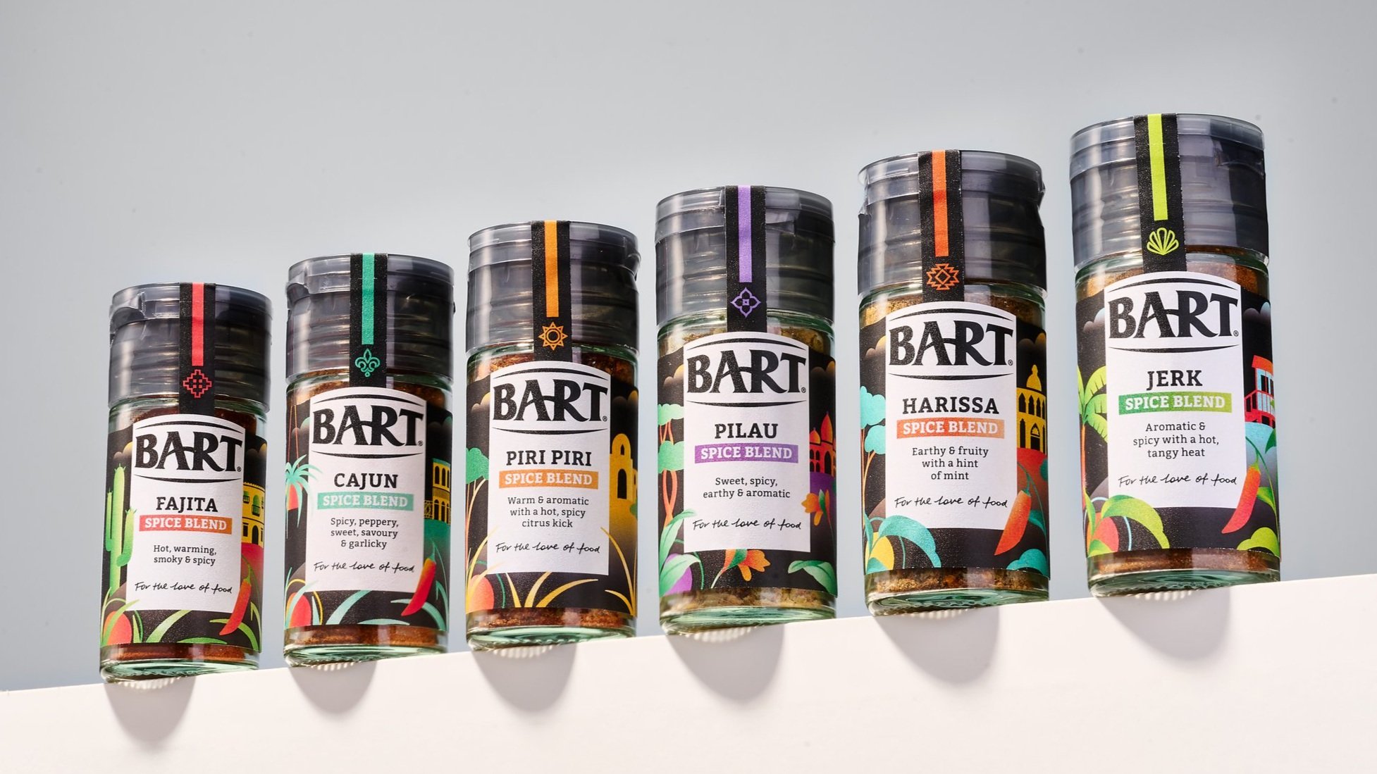
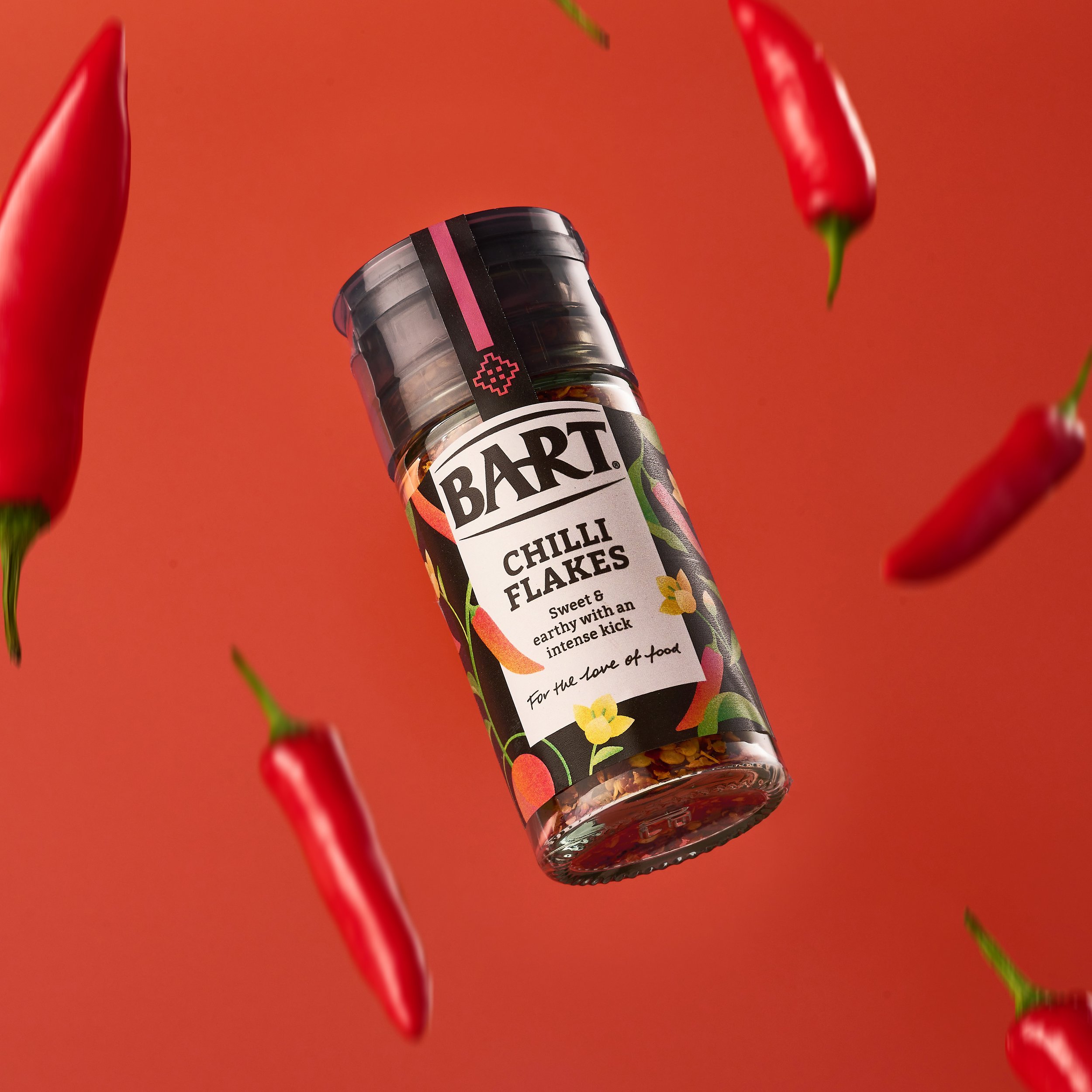
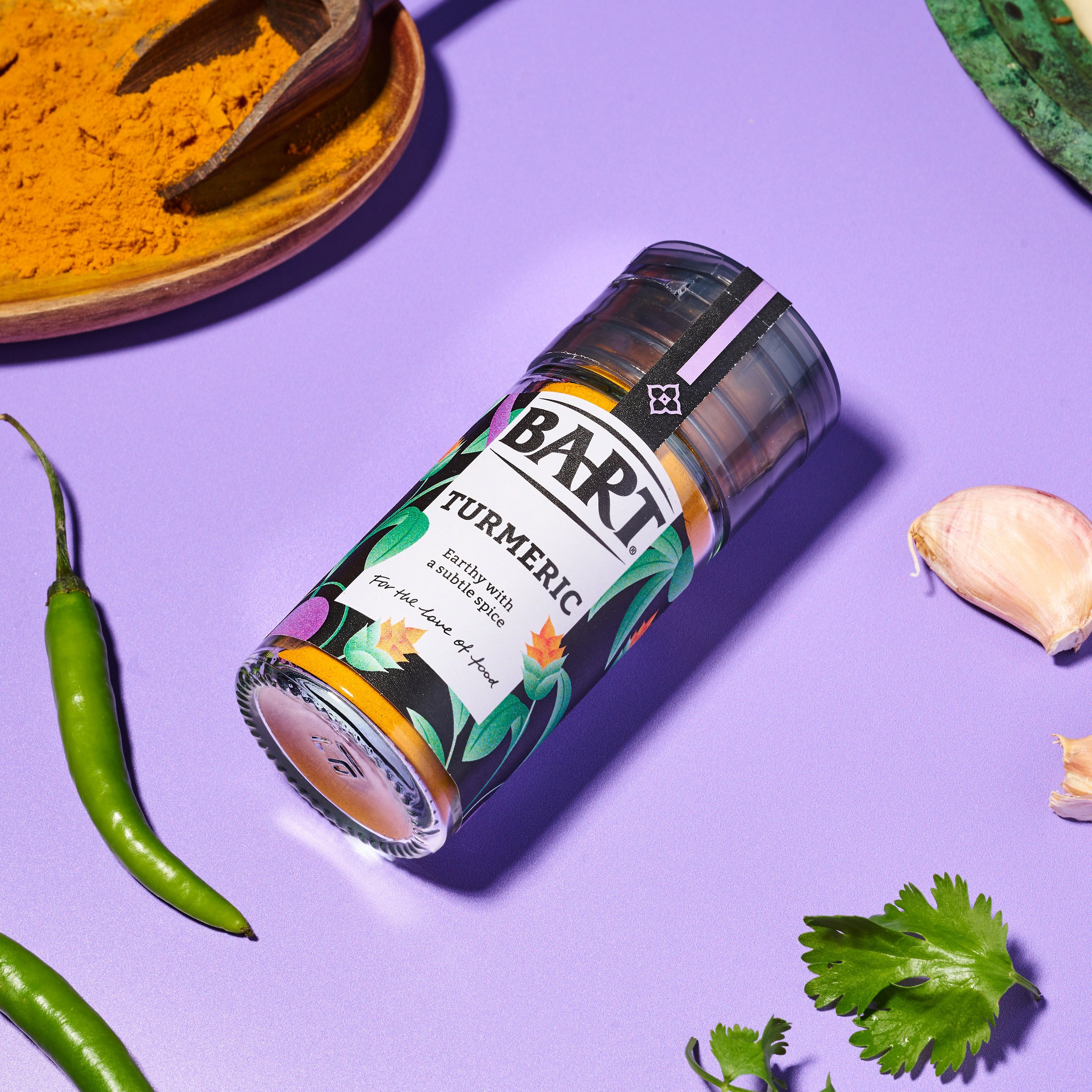
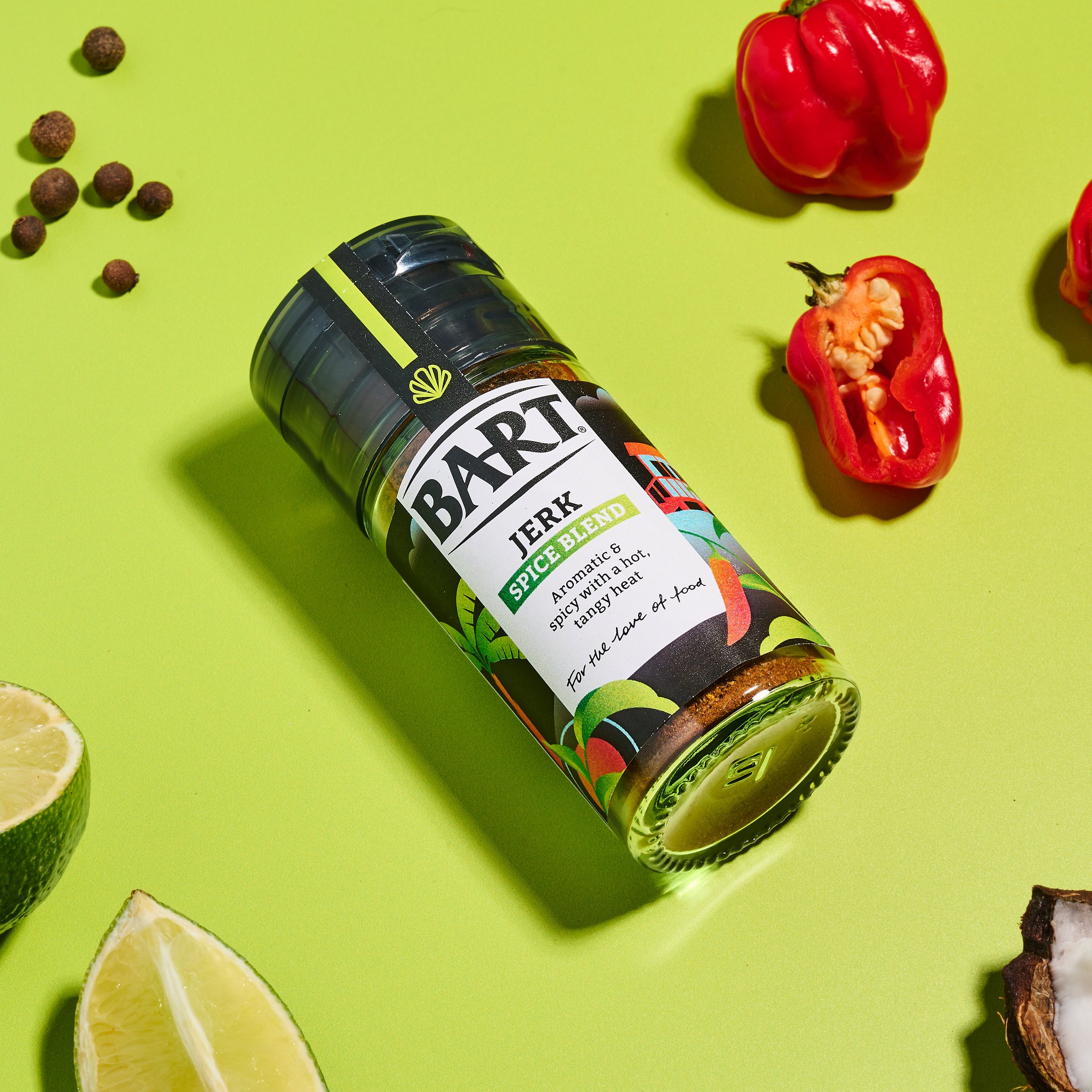
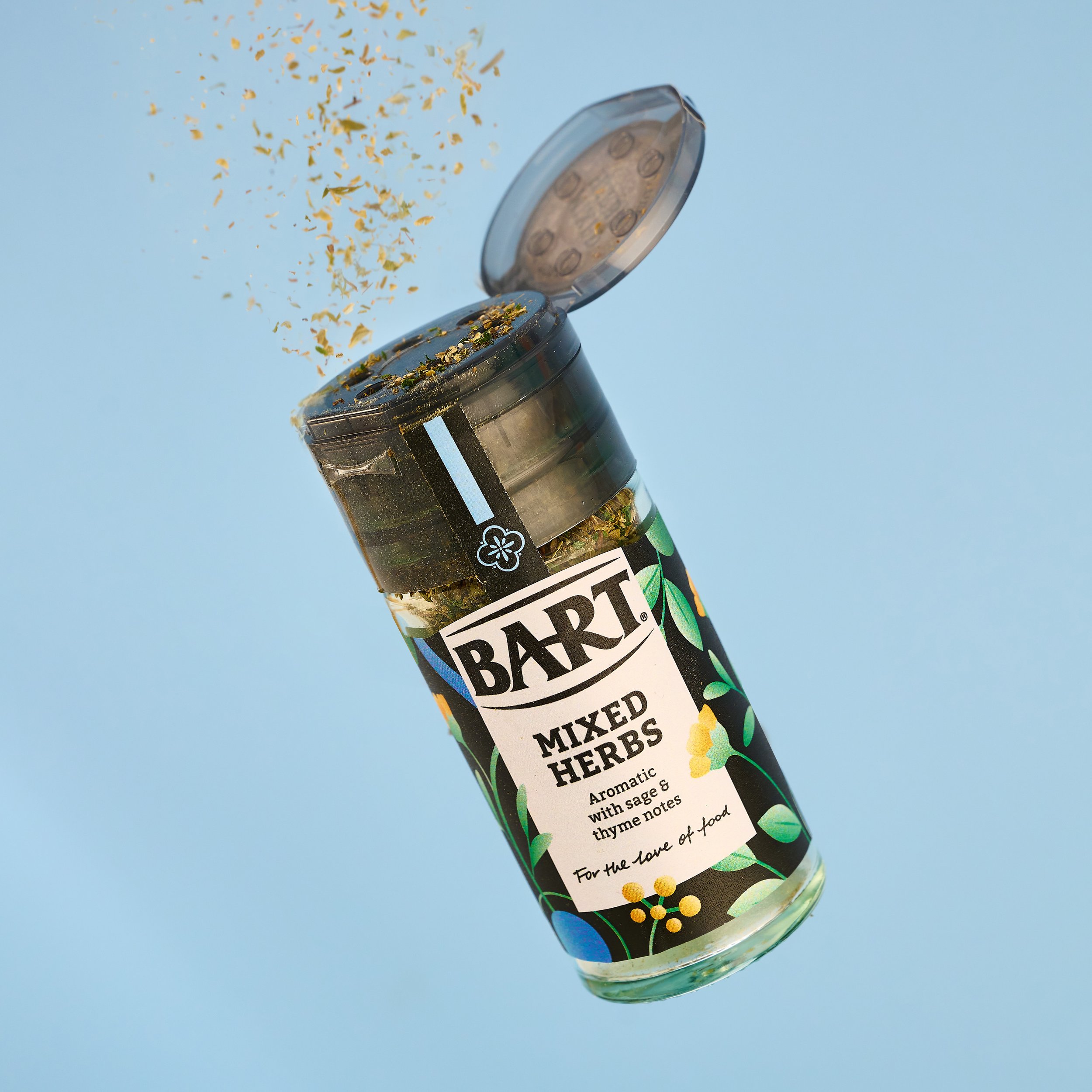
Initially producing designs for Bart’s range of world cuisine-inspired spice blends, the concept has been carried across the range of over 100 products, encompassing A-Z herbs and spices, chopped, pastes, salts, peppers, and seasonings.

The logo has been freed from the constraints of a holding device, which previously mimicked a kitchen stove brand with its silver on black colourways, and it now sits as black text on an off-white background with simplified horizontal brackets above and below.
Taking inspiration from the architecture, textiles, patterns, and symbology of different foodie regions around the world, we created a distinct icon, colourway, and illustration for each of the regions that Bart’s ingredients represent.
Rather than focus on the provenance of each ingredient or blend, we have segmented the range based on either the country of origin or the regional cuisine with which a particular ingredient is generally associated – The Mediterranean for basil and oregano and Latin America for chipotle chilli and cayenne pepper, for example.
Not only does the design system aid navigation in a busy category, but it allows Bart to elevate itself on a retail shelf largely defined by homogenous glass jars of powder. By alluding to historic spice routes and using colour and beautiful illustrations, it is a range that can be proudly displayed on kitchen shelves and spice racks rather than hidden away in the cupboard.
James Adams, Commercial Director at Bart, says the rebrand represents an important milestone for the brand. “The herbs and spices category has grown by more than £150m since 2019¹ and shows no signs of slowing down. Within this, Bart is currently the fastest-growing brand, with sales increasing over 61.5% year-on-year2. With cost pressures easing and viral food trends shaping the way Gen Z and Millennials experiment with food at home, the brand refresh is timed to appeal to the modern foodie and re-engage our existing customers. It’s an important milestone that is integral to our future growth and investment opportunities, as well as supporting the category as a whole.”


“We have long been fans of The Space Creative, particularly their work with fellow Bristol-born brands Pukka Herbs and The Real Olive Company, and we knew they would bring the right strategic and creative thinking we needed to set Bart up for the next chapter in its history.”
— Matthew Falk, Head of Marketing, Bart Ingredients