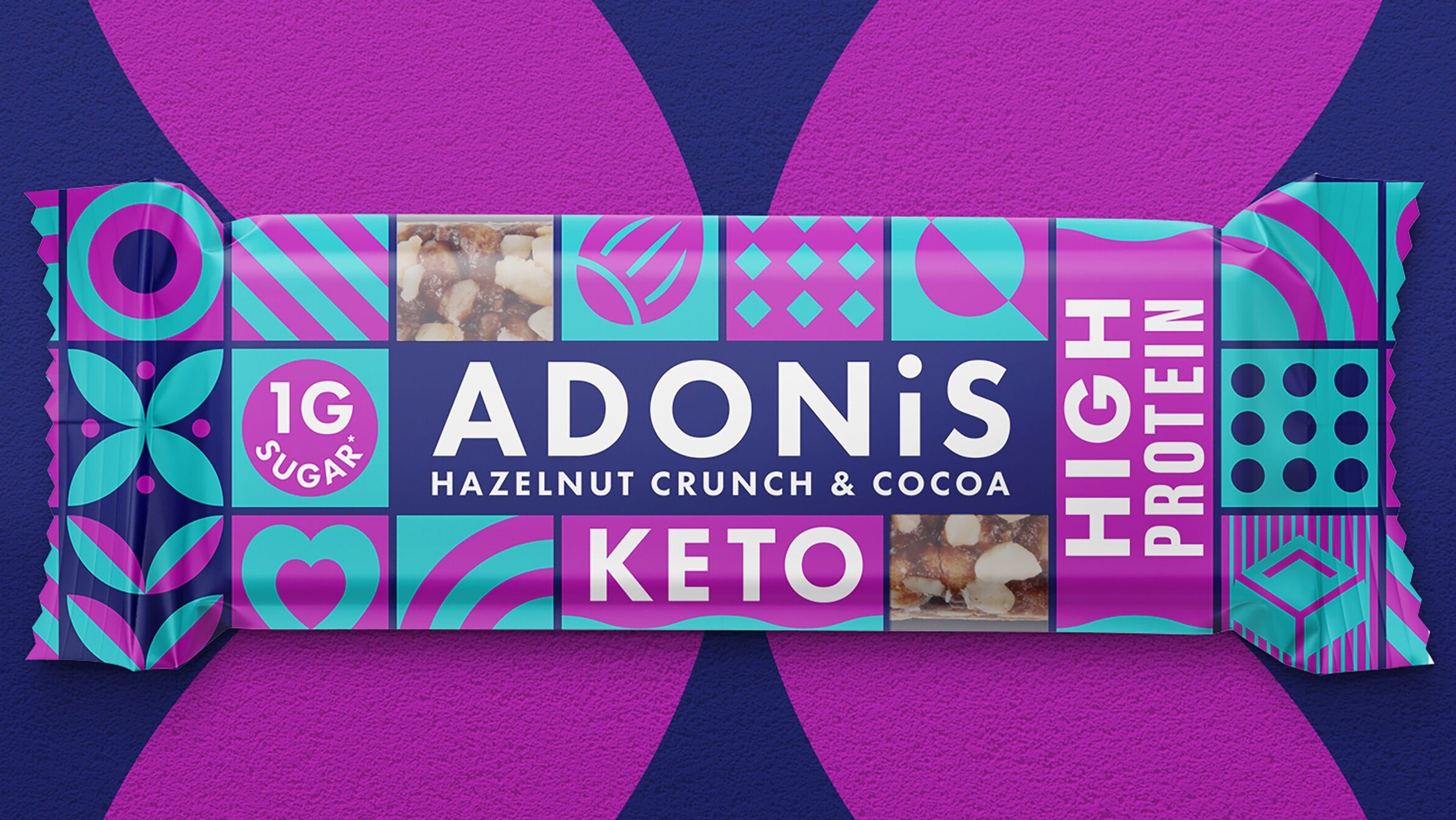
Gaining listings in the highly sought-after checkout aisle in Sainsbury’s at brand relaunch.
Brand Strategy | Branding | Illustration | Packaging Design
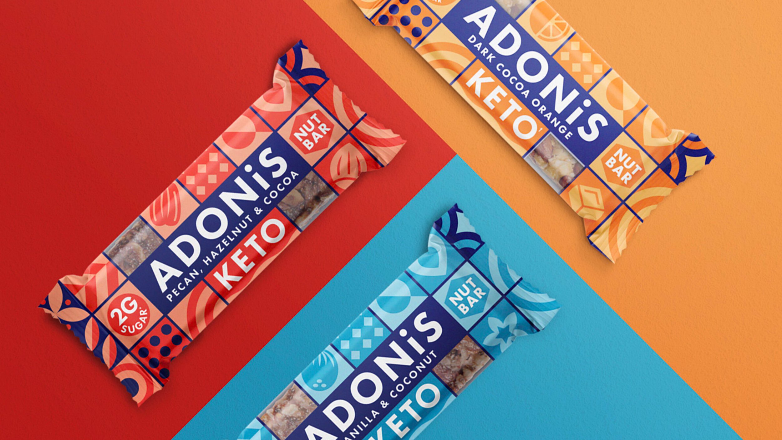
With so many snacking options to choose from, consumers are looking for products whose benefits are distinct and clear from the outset. Low sugar content, keto friendly and added vitamins are key drivers for health-conscious shoppers, and Adonis needed to better communicate their advantage over competitors within their packaging design.
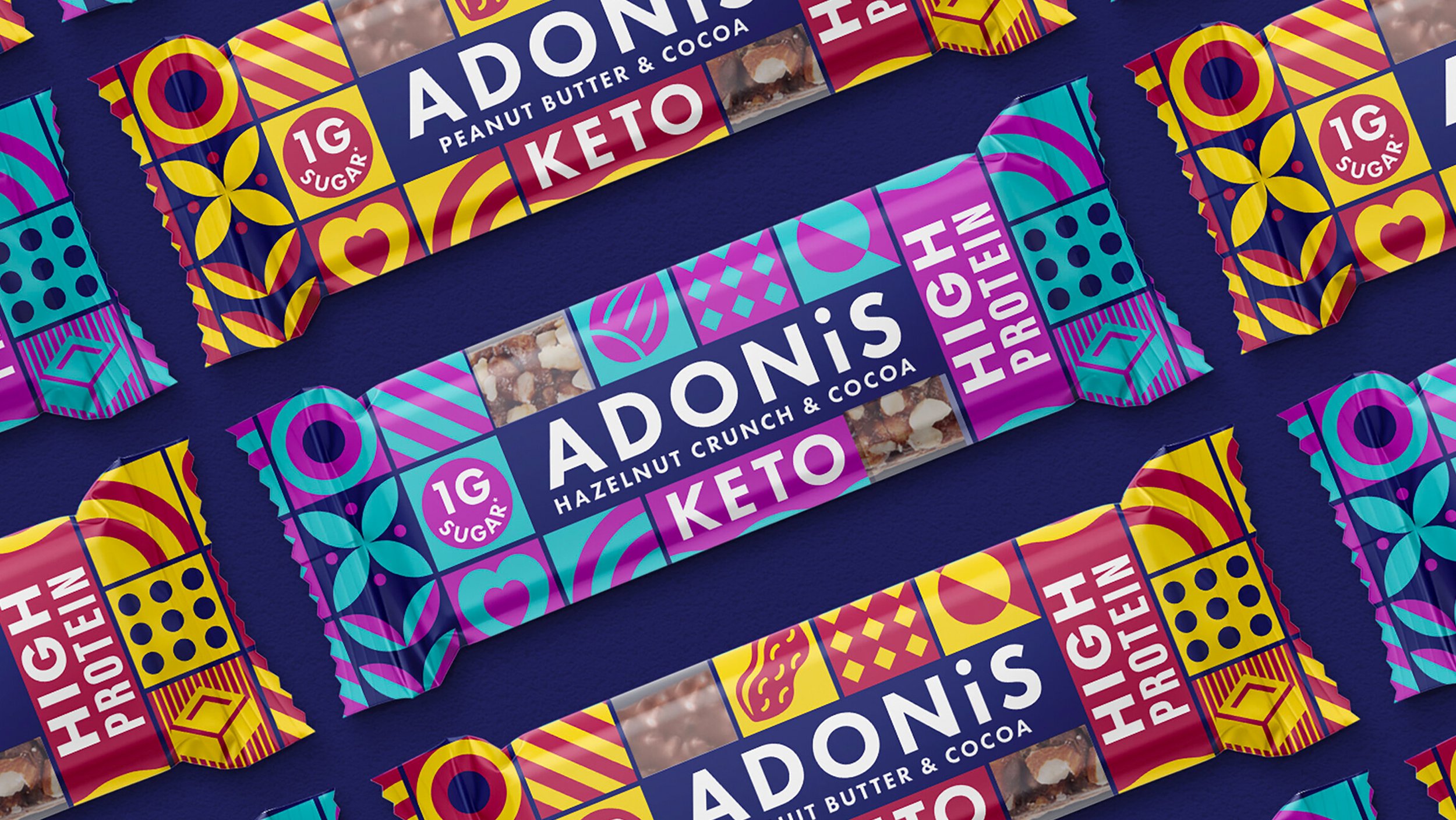
We helped Adonis revisit their strategy and rationalise their on-pack communication to create a standout brand design with a distinct personality and clarity of messaging. Snack bars have a limited real estate, so effective use of space on pack was key - we designed a modular system of geometric symbols and illustrations which can also integrate signposts for shoppers to enable them to understand the product immediately.
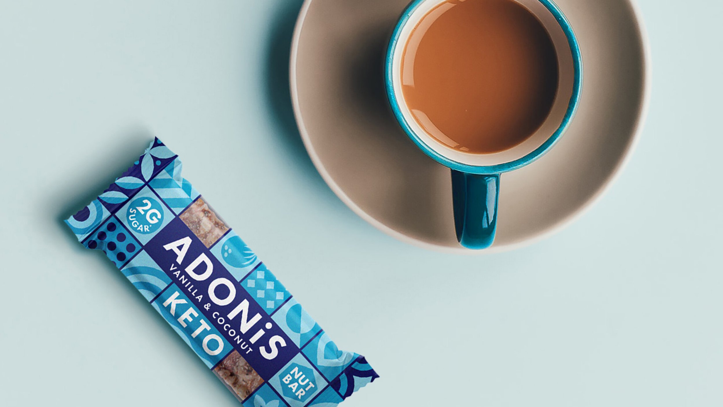
We made a massive rebrand together and the architecture is making us still very happy three years in – getting many compliments from buyers and shoppers, it's timeless, versatile and lends itself easily to expansion. Don't think we will ever change it. Best money we spent.
– Ingo Braeunlich, CEO Adonis
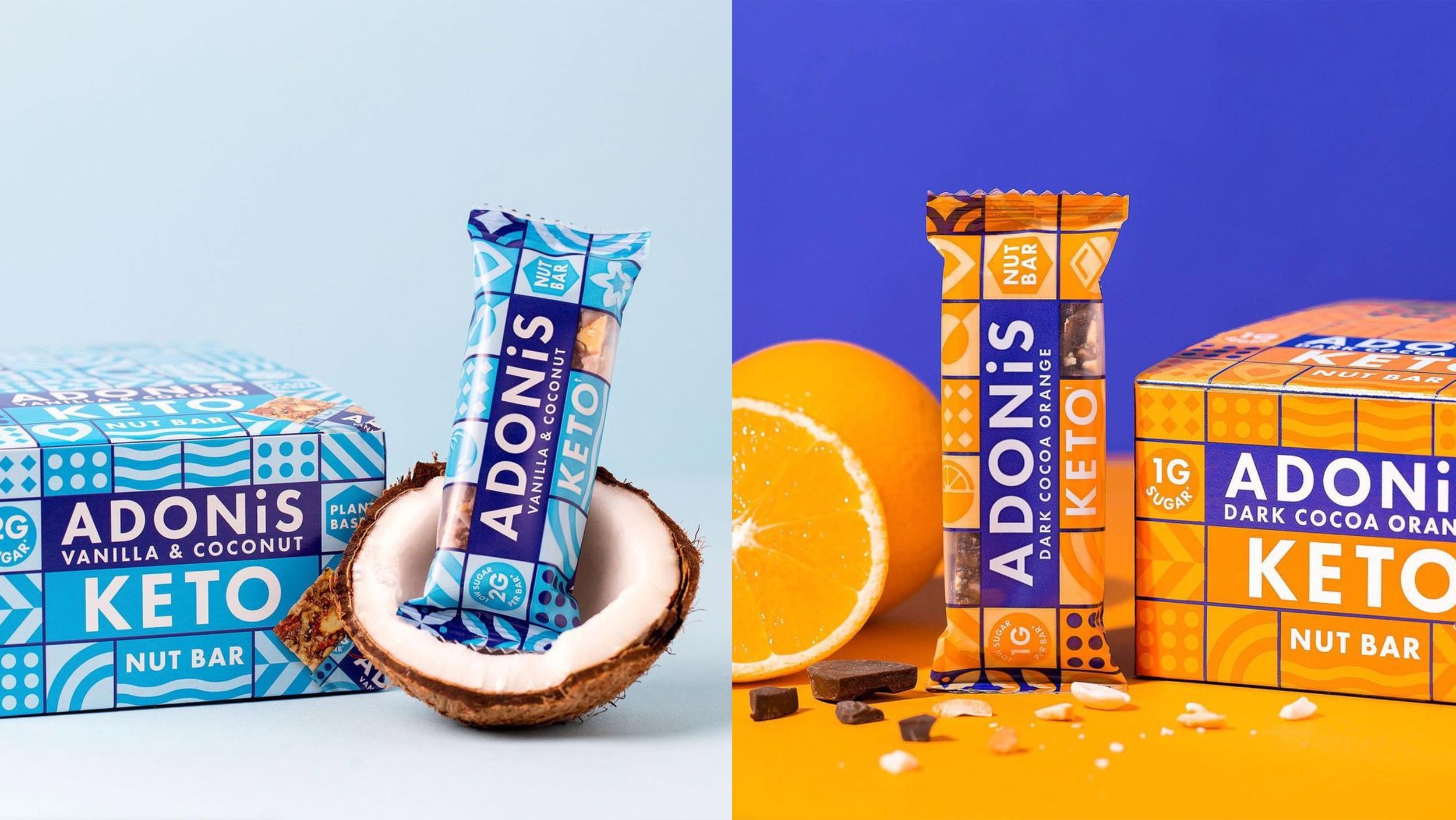
“We have thoroughly enjoyed our experience with The Space Creative. They clearly understood the character of our brand and successfully brought this to fruition. The process of creating our new branding with this team has been an absolute joy and we will be forever grateful for all the work they put in. We are so excited to begin this new chapter with our new branding and would recommend The Space Creative to any brand looking to take that next step forward.”
– Lara Shepherd, COO Adonis
